Enterprise GRC (Governence, Risk, and Compliance) Software
Role
Lead User Experience Design, Product Design.
What is RegScale
RegScale's is a API-centric platform that automates and digitize the collection, compilation, and reporting of data related to an organization's compliance obligations. By automation and UX optimization, RegScale ensures that companies are continually compliant, reducing risk and cost while simultaneously increasing productivity.
Description
RegScale needed an experienced full Cycle User Experience designer to join the company and begin to build out UX standards, best practices, and design language.
Goals
- Bring application up to standards with basic usability and product design standards.
- Improve overall user experience of the application using domain knowledge, heuristics, and professional / customer feedback.
- Create and maintain a scaleable design language
- Build and maintain design library of components
- Build out features requested by business
- Create blue sky / future states of the application
- Maintain general watch over the application experience as we expand as a company and software.
Contex
I was employee number 3 at the R&D office along with the CEO/CTO and one other developer. At the point that I was hired the application was in their 3.0 release. The application worked, but lacked consistency and UI polish. RegScale was preparing for series A funding and needed to bring the application to a state that was more attractive to investors with a plan for improvement.
Role
My Role: I was expected to improve, build, audit, and maintain the software as a whole and interact with teams as we grew as a company to build out features and interface with the development team in the maintenance of a design language.
Entry Point
I joined the company at their 3.0 versioning. At that time the application was at an MVP / v1 level but was in sever need of combing over and general design work. Also a challenge was the domain in which I was designing for. Compliance is a background vibration of most companies that exist but it is not very apparent to a day to day consumer.
My initial days of working at RegScale was warring to getting domain knowledge and understanding the product space along with planning for “quick wins” product wise. This meant applying best practices and heuristics to the application to get to a more solid baseline of user experience and functionality patterns between pages.
At this point it was clear that I need ed to conduct a full audit of the application and plan for a design system to manage the breath of the application.
High Level overview of 3.0 era RegScale3.0 era RegScale Home Page3.0 era RegScale Forms Page
First Steps
RegScale is an extremely large application. The world of compliance is very dense and bureaucratic often taking teams of people weeks to months to complete tasks of an astounding breadth of topic. Depending on the kind of security framework you are trying to become compliant end you may have hundreds of controls to fill out and maintain across your company.
To more fully understand what the application was covering and capable of I conducted a full application audit. This gave me a bird's eye view into the state of the application so I could begin to break the application down into areas to work on.
First Applicaion Audit - this ended up being a semi high-level audit of the applicaion. There are ~80 more pages of the application but at this pooint I just needed to familiarize myself with the app.
Quick Wins
While I was familiarizing myself with the application and planning for larger overhauls, the CTO asked me to do some initial designs for the application that could be quickly implemented. These changes were just initial
designs to get a revised design language started and move away from these MVP-level UI designs.
These designs were early and devoid of heavy UX, but some general stylistic choices could be made to refine the application. I would soon learn about the extensive user experience of the application; a process that I am still learning almost 3 years later.
- Updated module dashboard cards to be more informaton dense. This allowed for more modules to be viewable on screen at once.
- Moved pages into a floating tab in the top right hand corner. This reduced pages in top nav and improved navigation context.
- Introduced the idea of a "Explorer" this allows you to view your record within the context of your enture security program. Similar to how a tree view allows you to see your data within context to other data.
- Redesigned the subsystems into a side bar to free space.
Component Audit
A pivotal part of refining the early application into a more consistent product was conducting a thorough component audit. During my initial experiences with the app,
I noticed numerous inconsistencies in the color schemes and button designs. As the person responsible for overseeing the user and product experience, it was crucial
to consolidate the UI and develop a scalable, consistent design language for future use. This effort also improved the overall CSS and coding of the application by
streamlining components and UI elements. This process would be repeated multiple times to ensure the design remained cohesive.
Component Audit cont.
After gathering all the various buttons and components, I started a design refresh and consolidated the buttons. This gave me an initial set of designs and components to review with the CTO and developers while also having an updated set of buttons to use in the interim while I work on other requested features. Next, I transformed these quick designs into a comprehensive design language and library.
- Initial audit with a rough draft of new components.
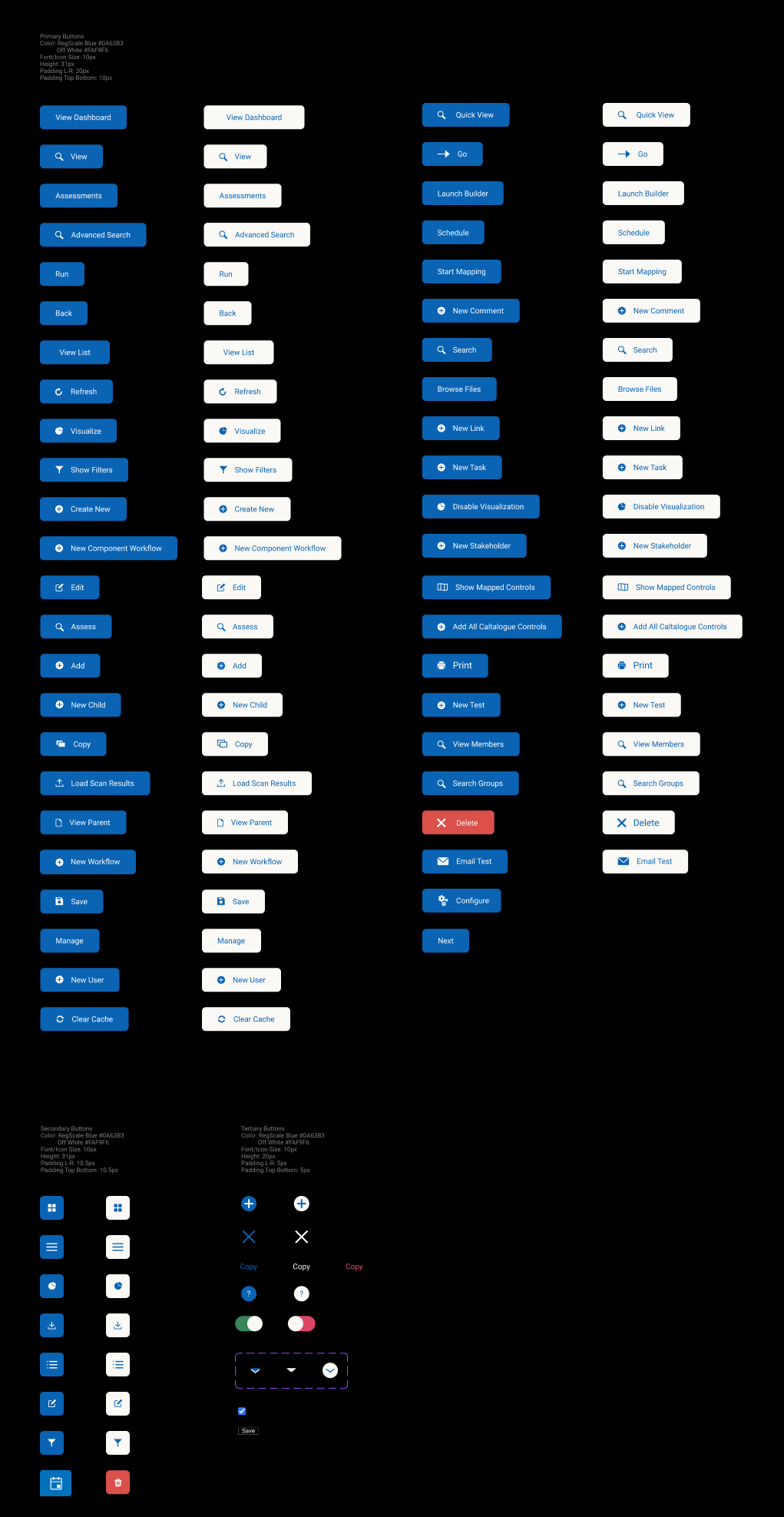
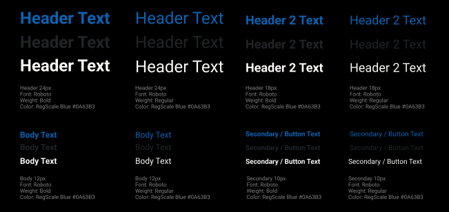
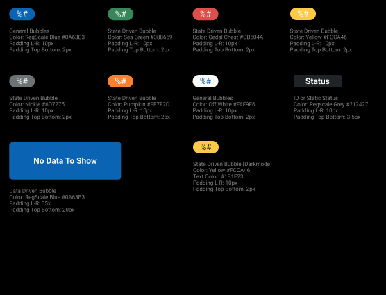
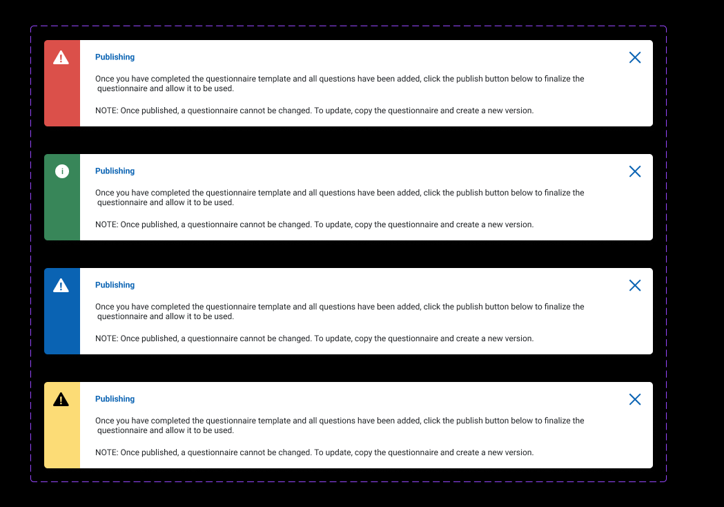
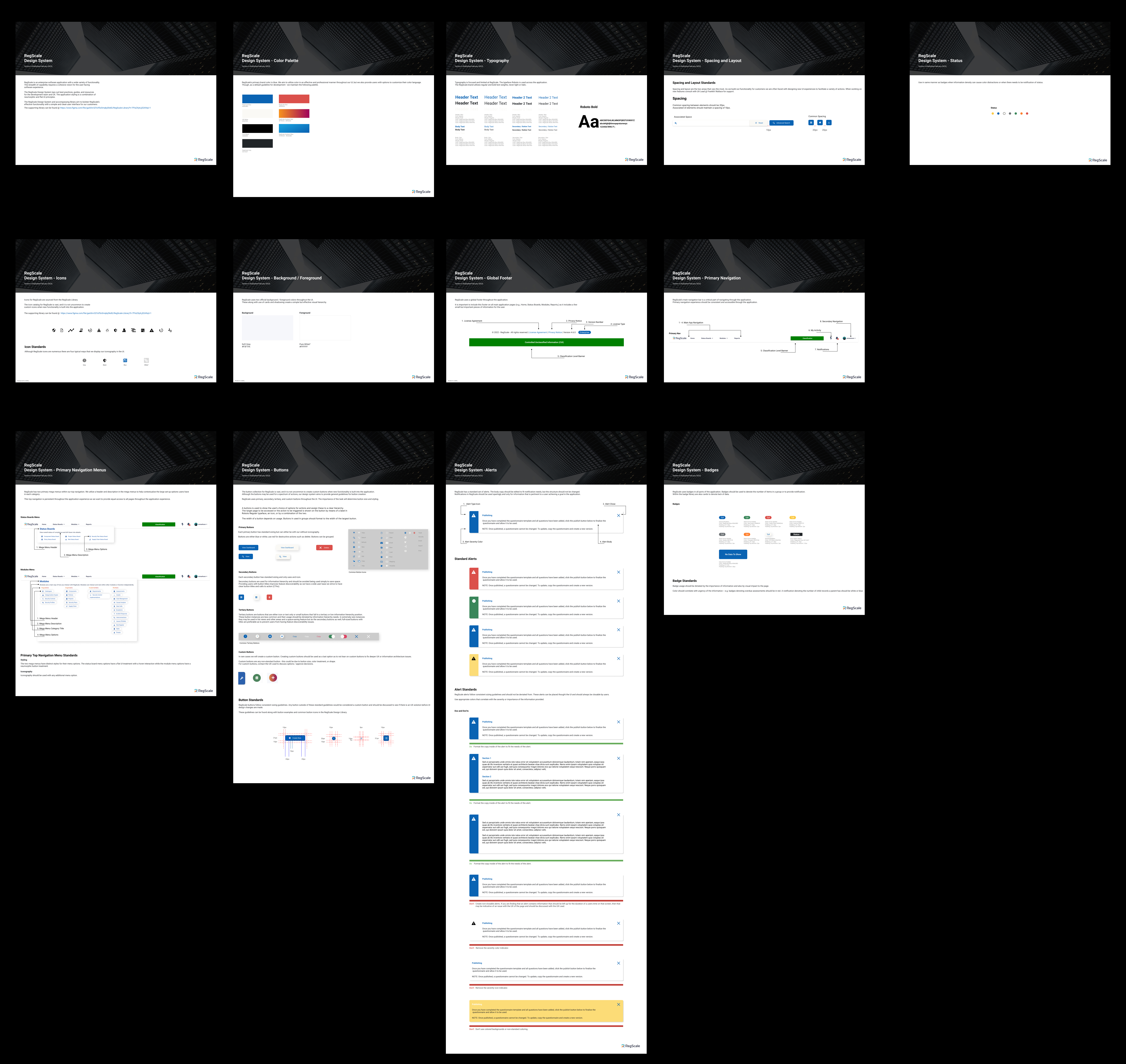
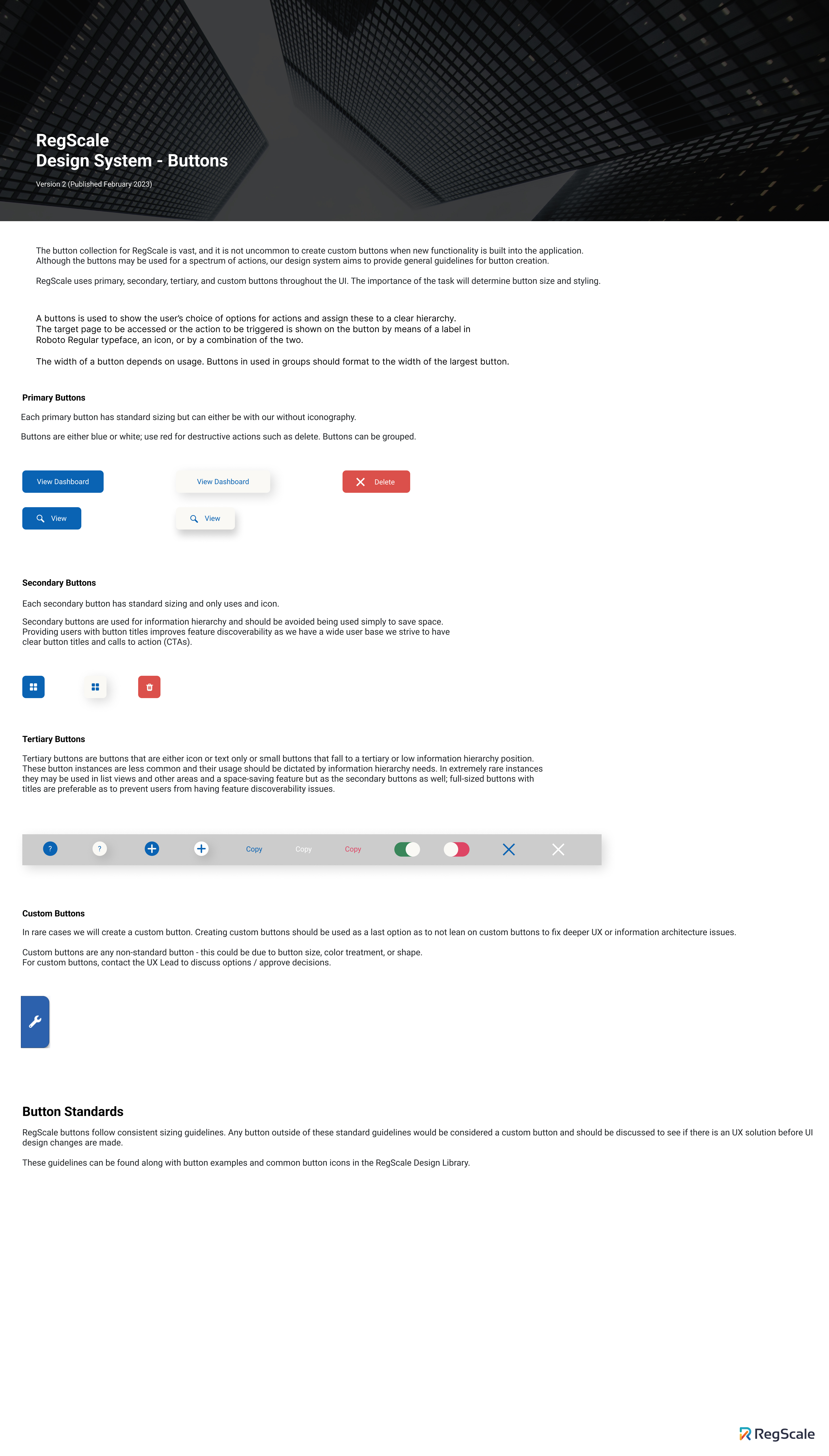
Design Library
The first version of the design library was pivotal in creating a cohesive look and feel for the app. Previously, each page had different variations of the same group of buttons, leading to a highly inconsistent user experience and a development burden due to the repeated use of hard-coded elements and excessive CSS. This approach created significant technical debt by relying on non-dynamic, non-scalable UI elements.
The library I created focused on scalability and consistency, emphasizing color language and typography. Additionally, it was important to develop page templates and patterns that could accommodate a range of goals without varying too much.
Since this was the company's first design language, it was crucial to be thorough and detailed in defining the breadth of components.
- Version 1 of RegScale Design Library.
- Buttons from the first design library.
- Typography guide from the first design library.
- Badges from the first design library.
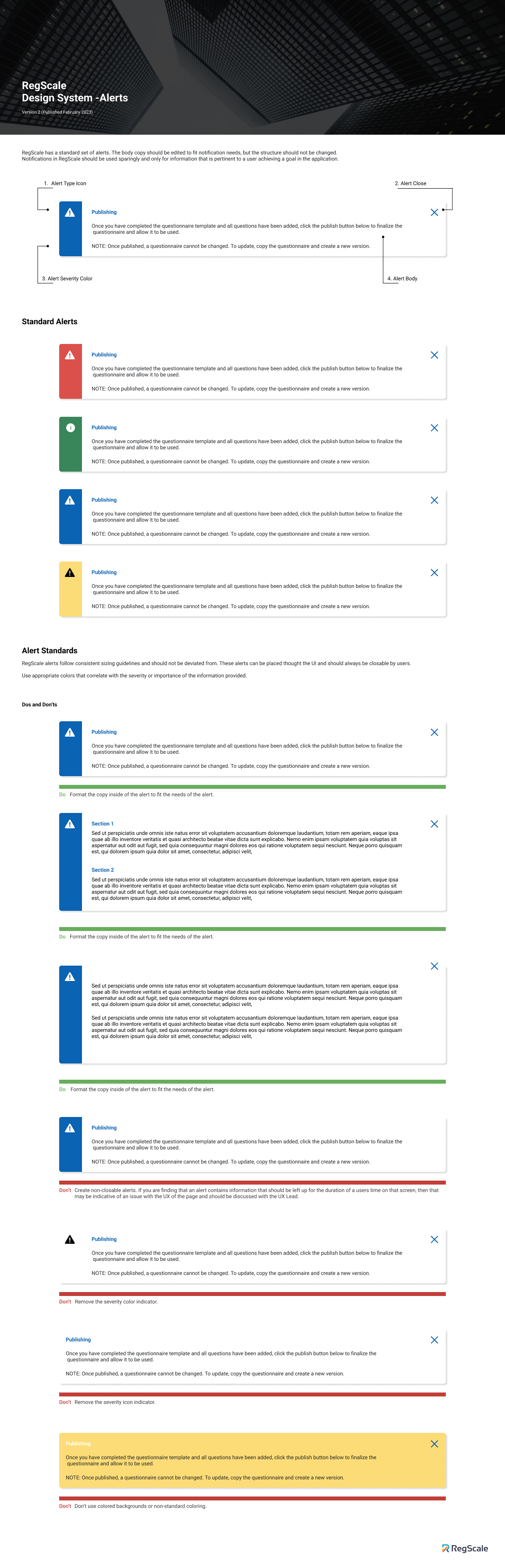
- Notifications /alerts from the first design library.
Design Library cont.
Along with a complete component library, I created guides and documentation to complement the design library. This work provided us with essential building blocks to refine the app and remained relevant for over a year as we continued to grow.
Another beneficial aspect of the design library was that it allowed me to design and iterate much faster than before. When I first started working on RegScale, I relied heavily on copying and pasting to duplicate screens and elements.
With the library, I could now retrieve components from their folders and toggle between each one using Figma's UI.
- Guides from first design library.
- Page templates from first design library.
- I kept a change log updated with any additons and corrections made to the library.
Documentaion
Along with the library I also wrote documentation for the company on usage and examples.
- Full documnetation.
- Button documentation.
- Alerts documentation.
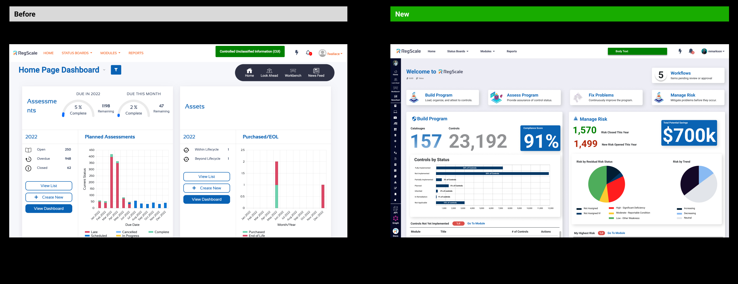
Regscale 4.0
While creating the design library, we simultaneously launched a major update to version 4.0. As an early-stage company, we were rapidly iterating on the application to add value for our current customers and build features that would strategically maintain our competitive edge. We were also aligning our development with the overall vision of our CEO/CTO and preparing for our Series A funding. It was crucial to design a product that looked cohesive and professional, which added multiple layers of complexity to manage. The 4.0 era proved to be my biggest learning experience.
After completing my first design library for RegScale, I began working on a comprehensive redesign of the application. This redesign went much further than the initial audit, covering every single screen of the application. It aimed to unify the entire application under one cohesive look and feel, implement new navigation and user experience paradigms, and set the stage for future features.
The world of Governance, Risk, and Compliance (GRC) is complex, requiring the GUI to facilitate dozens of dense user flows, each varying based on the security framework a company needs to comply with. Some companies may even create and maintain their own controls, adding another layer of complexity to the application. Due to these fundamental needs and the high-powered functionalities that RegScale offers, it is an extremely dense application.
Over the next two months, I carefully documented and updated the entire application using the new RegScale design system.
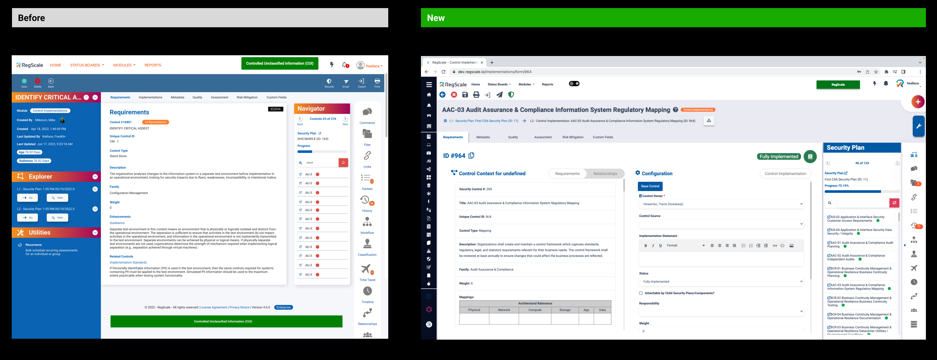
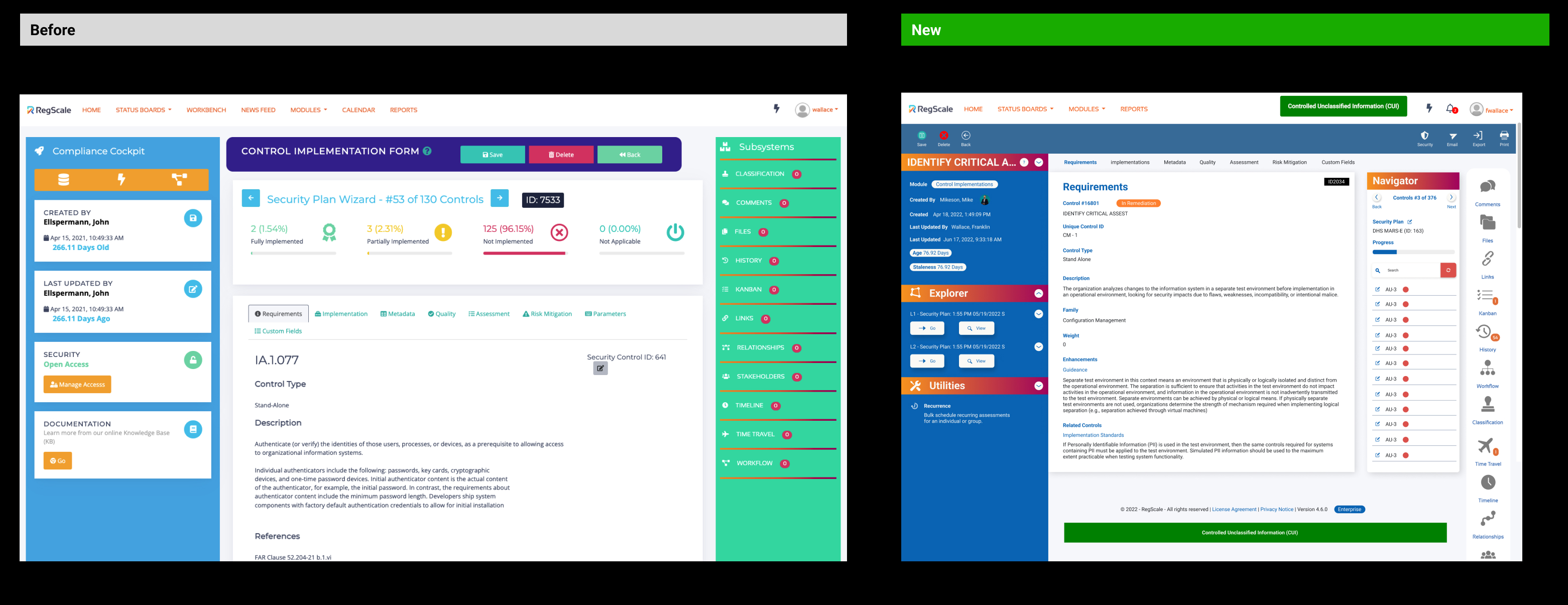
- Control Implementations Form
Learning from the Application
This part of the application taught me the most. I joined the company with zero knowledge of compliance, an extremely intricate field where many spend their entire careers without fully mastering it. This challenge pushed me to learn about a new space while consistently providing value to the product and ensuring my lack of domain knowledge didn't slow down our small but growing team. I had to rely on my years of experience and expertise in user experience, information architecture, and product design to make informed decisions about the application.
One of the most challenging aspects of the application was obtaining user information and conducting testing. Due to the nature of compliance and our almost exclusively government and military contractor customers, we couldn't install any user tracking on their software. To work around this, we held regular meetings with our customers and conducted feedback and design sessions with a select group of users. We also frequently met with compliance specialists and domain professionals to discuss user flows, processes, and user experience problems through demos and prototyping.
While this provided excellent feedback, a significant hurdle remained: the lack of behavioral user data that reveals the core unintentional user experience patterns and quirks that can't always be explained with design theory. The ideal data comes from observing and quantifying behavioral habits.
- New Home Page with new design system / language
- New Control Implementations Form
4.0 CONT.
The 4.0 version of the application went through many phases and updates but remained structurally the same for about a year. During this time, our company and team grew, and we began to envision a better version of the application. Feedback from customers and sales teams guided my designs, and I gained experience in understanding the product for our customers. Eventually, I decided we needed to refresh the application's design language and some core UX elements.
Improving the Application
After about a year of gathering feedback, we identified some core issues. The application was not walk-up user-friendly. Initially, we designed it for experienced users, like compliance officers with 20+ years in the Navy, rather than the more common user who was assigned the task by a manager and now had to gather and fill out specific information, often involving tens or dozens of people.
Another issue was the increasing number of fine details that were faulty. As the sole designer for an application with over 130 individual pages, each containing multiple screens and user flows, it was a huge task to maintain consistency. This challenge grew as we expanded, with a full team of developers working independently on various features.
Other areas needing improvement included general typography, color language, button usage, and information hierarchy. While the application made significant progress and helped secure our funding, it was time to review and enhance what we had done the previous year.
After discussing these issues with our larger team and engaging in several weeks of critique and brainstorming, we decided to simplify the application fundamentally and improve consistency.
4.0 Era RegScale
4.0 Take Aways
During the 4.0 era of RegScale, while building out features and making the compliance product more powerful, I had several key user experience and product design takeaways:
Hierarchy: In the earlier iterations of RegScale, there was a significant discoverability issue. To address this during the 4.0 era, we moved many pages to the forefront of the application, both visually and in navigation. However, this led to a loss of critical hierarchy within the application.
Color Language: The importance of a consistent color language became evident. Our color usage had become complex and redundant, with component and typographical colors often overlapping. Instead of using color to focus, highlight, and delineate, our UI became busy and visually overstimulating.
Navigation: Due to the lack of hierarchy, navigation through the application became distorted. Given our application's wide functionality, we brought many pages and directions to the forefront of the UI. As a result, users could take multiple paths, causing the application to lose a clear narrative or path to achieve a task. It required a high level of domain knowledge for users to navigate the application and understand what actions to take to achieve their goals.
Ease of Use: Initially, we designed for a pro user persona—someone fully fluent in all aspects of compliance. Over time, our main persona shifted to a more average user, someone tasked with completing a task in unfamiliar software or filling out dozens of controls. We needed to consider their struggles, emotions, and friction points.
Lack of Knowledge About User Base: Designing was challenging when we assumed our users operated in a certain way. This assumption stemmed from primarily talking to career compliance professionals rather than average users, resulting in a very dense experience for the average user.
Overall, these insights highlighted the need to improve the application's hierarchy, color language, navigation, and ease of use while gaining a better understanding of our user base.
Next Steps
The first step in this new era of RegScale began with a working file called "Simplification." This file served as our starting point for identifying key areas of improvement and outlining our objectives for those areas. It provided a space for high-level discussions on how to break down the project into manageable tasks.
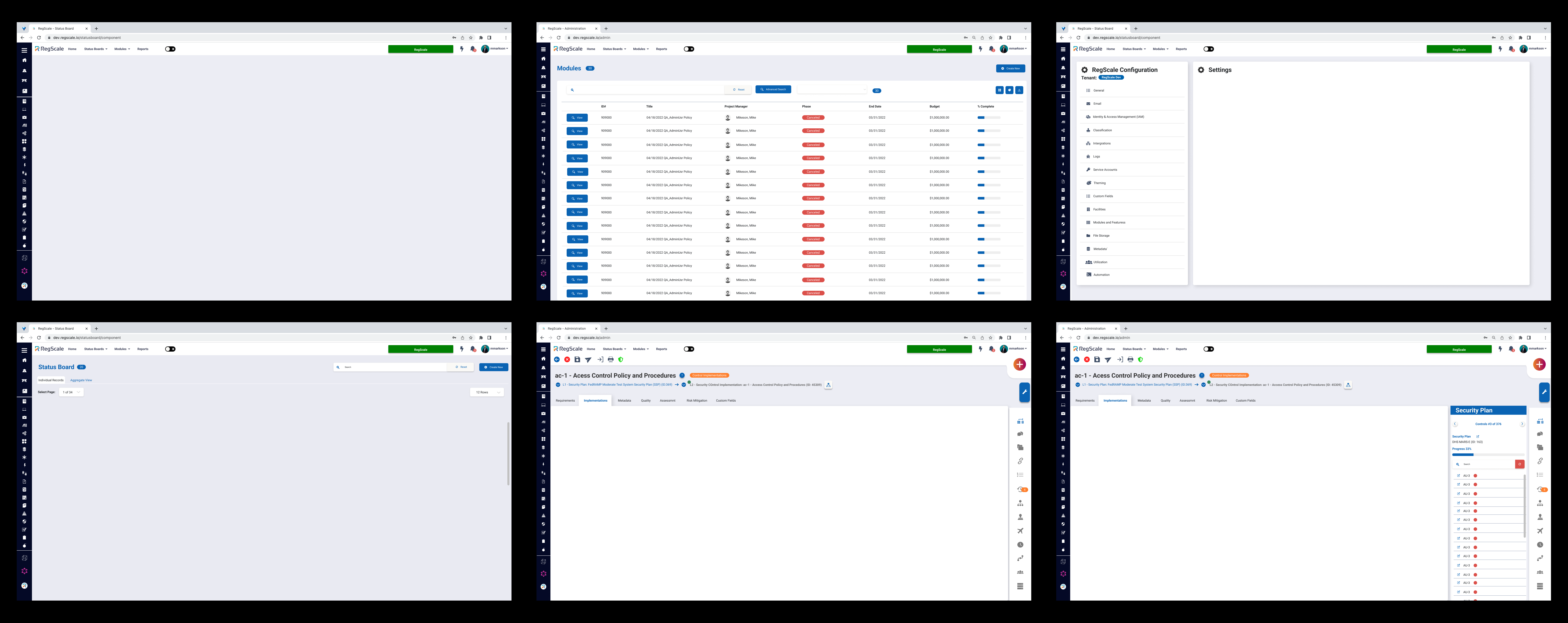
I initiated a comprehensive application audit to gain a bird's-eye view of the app, which helped guide our decisions and scope out all the necessary work.
4.0 Audit
To gain a better understanding of the application's current state, I began an audit. This involved high-level documentation of the application as it stood with our first design library applied. This was the version that users had been using for about a year and from which I received substantial feedback.
The audit lasted a few weeks and became a key document in developing our new design language.
One of many pages of the 4.0 Audit
One of many pages of the 4.0 Audit
One of many pages of the 4.0 Audit
Design Language
After several design meetings and a reviews of the audit findings, we decided that the number of changes we wanted to implement justified a complete design language update. We agreed that the main areas to focus on were the navigation, forms, and overall color scheme of the application,
with the primary goal of simplifying the application experience both mentally and visually.
The next few months involved an intensive review and revamping of the application. I focused on documenting, critiquing, and refining broad areas of the application.
Simplification
One specific area of focus was the "forms."
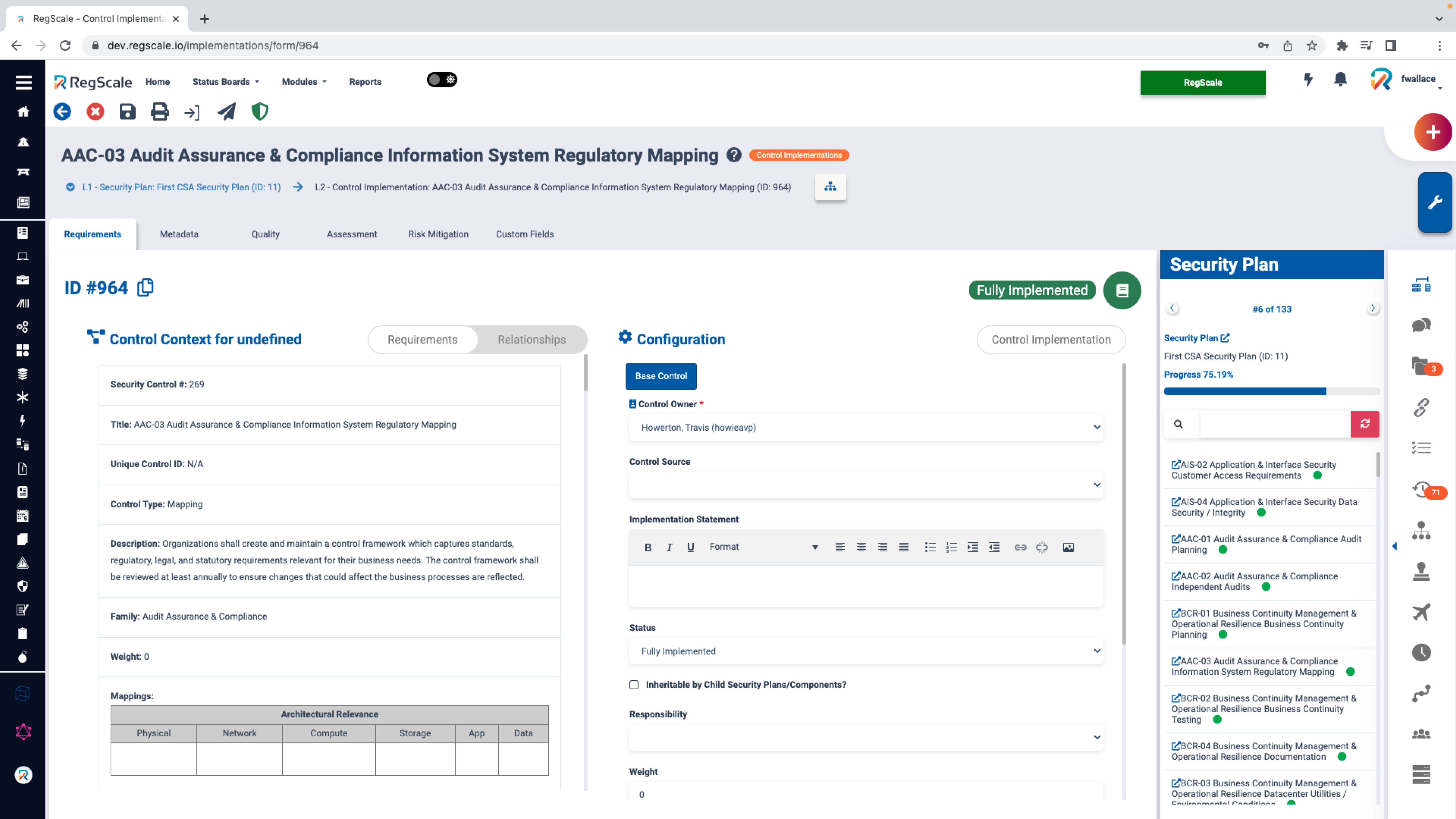
The "forms" section of the application is the fundamental working page that the entire application and its components are built around. This form allows users to interact with, nest, and edit controls and their associated child elements.
Due to the way the application was originally coded, the forms had not been updated during my entire tenure at RegScale. They were coded inefficiently and were not modular, with many hard-coded elements. The sheer number of modules meant there was a significant amount of technical debt to address before we could even begin to optimize the forms for user experience. The forms needed to be broken down into reusable templates, and all page elements needed to be turned into scalable and customizable components that could be edited globally.
After a rigorous design process and analysis of customer feedback, it became clear that the most significant area for improvement and impact on the user experience was the forms. We decided to proceed with the design language update and began preparing for a large-scale forms refactoring.
My responsibilities shifted to designing a new forms experience that was scalable and addressed all the issues we had identified over the past year.
Throughout this process, I created a Design Language document that illustrated all the changes we would be implementing.
Design Language document that illustrated all the changes we would be implementing.
Design Language Cont.
Forms are multifaceted pages that serve as the fundamental working pages around which the entire application and its components are built. Users can interact with, nest, and edit controls and their associated child elements through internal pages, subsystems, and utilities.
A good way to imagine a form is as a frame to which you can attach tools and storage, allowing the form to become useful for a specific compliance task (a module). For example, one module form might have two sub-pages and no utilities (every form has subsystems), while another form might have twelve sub-pages, five utilities, and subsystems.
The security plan form alone has numerous different pages and states, comprising 70 screens in total. This form is just one of 30 modules, illustrating the sheer depth of the application and the need to approach its design from a scalable, component-oriented perspective.
Given this level of variance, it was important to update the application from both the backend and the frontend to improve the user and application experience. One page might have dozens of page states and possibly hundreds of associated records—too much to account for manually. Therefore, it was crucial to create a consistent, watertight design language. This ensured that as the app was used by companies and organizations of various sizes, their application experience would remain consistent, no matter how many states their forms were in.
The decision to update our design language addressed the inconsistencies and friction points found in the application form experience. Fixing these pain points had a trickle-down effect on the overall look and feel of the app, bringing it into a new era and necessitating a new dot release.
V1
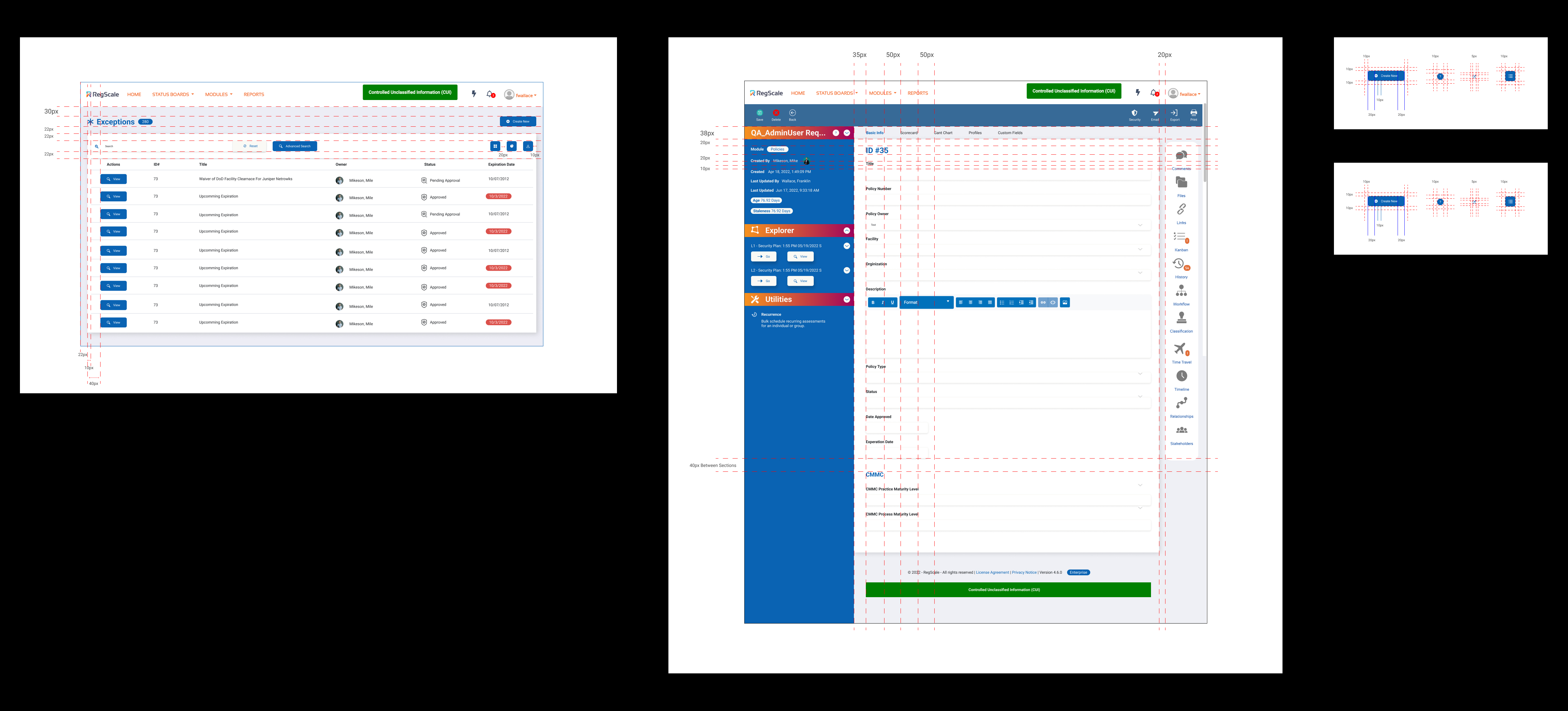
New forms were introduced after improving our design language. The aim was to reduce information overload, improve color usage, fix information hierarchy, and optimize navigation.
The sidebar dashboard was removed, and those dashboards were moved to the respective modules. The top banner of buttons in the old form was redistributed into the page. I started to use tab navigation and mega menus to store all of the various pages that the form contained.
I also improved our badging usage and reduced the overall color on the page. Additionally, I simplified the way that form fields are displayed on the page.
V2
After creating the first version of the new forms with our new design language, I continued to refine the screens through weeks of critique and feedback. I decided to remove the status bar at the top to reduce bespoke iconography usage, as it contained information that was not pertinent to the users based on our refined user personas. I also reclaimed some space in the margins and moved buttons into a multi-function dropdown/save menu. This further consolidated the navigation and improved the hierarchy for the most commonly used buttons on the page.
Final
3.0 forms vs 5.0 forms
5.0 Design System
To wrap up this phase of work, I created an updated design system. Importantly, I also improved the way it was built in Figma, utilizing Figma's advanced properties, states, and variant options. This made design and iteration faster, reducing design time and turnover to get work back to developers. This new design system exemplifies our new design language and is scalable throughout the entire application.
New RegScale Design System
Updated form fields
Updated forms
Updated list view
Summary
My journey at RegScale began as the Lead User Experience Designer, where I was tasked with establishing UX standards, best practices, and a cohesive design language for the company's API-centric platform. RegScale automates and digitizes the collection, compilation, and reporting of compliance data, ensuring continual compliance and increasing productivity for organizations.
When I joined, the application was in its 3.0 release, functioning but lacking consistency and UI polish. My initial goals included bringing the application up to basic usability and design standards, creating and maintaining a scalable design language, building a design library of components, and improving the overall user experience based on domain knowledge, heuristics, and feedback from professionals and customers.
Starting as employee number three in the R&D office alongside the CEO/CTO and another developer, I was thrust into the complex world of compliance—a domain I initially knew little about. My early days involved gaining domain knowledge, planning quick wins for the product, and conducting a full application audit. This audit revealed numerous inconsistencies and areas for improvement, guiding the creation of a scalable, consistent design language.
As the company prepared for Series A funding, the need for a polished, cohesive application became paramount. I conducted a component audit, identifying and consolidating UI elements to streamline the application's look and feel. This process was repeated multiple times to ensure design cohesion.
The transition to version 4.0 was a significant learning experience. We rapidly iterated on the application, adding value for current customers and aligning with the strategic vision of our CEO/CTO. This period involved a comprehensive redesign covering every screen of the application, unifying its look and feel, and setting the stage for future features.
Key takeaways from this era included the importance of hierarchy, consistent color language, and simplified navigation. Initially designed for experienced compliance officers, the application needed to be more user-friendly for average users tasked with compliance responsibilities. Regular feedback sessions with customers and compliance specialists helped us address user experience challenges, although the lack of behavioral user data remained a hurdle.
After about a year of using the 4.0 version, we decided to simplify the application further. A new audit and design language update focused on navigation, forms, and color schemes. The forms, a fundamental part of the application, underwent a significant redesign to improve scalability and address technical debt.
Throughout my time at RegScale, I created comprehensive documentation and a Design Language document that illustrated our changes. This iterative process of auditing, designing, and refining ensured that RegScale's application evolved to meet the needs of its users while maintaining a professional, cohesive appearance for investors and customers alike.
Currently, my main focus is on maintaining and improving the application, while continually gathering feedback and insights to enhance the platform's value. I collaborate closely with developers and leaders to develop roadmap items and introduce new features.
Looking ahead, the next phase for RegScale will prioritize creating a highly customizable application. We've observed that, given the diverse needs across industries and companies, users prefer and are eager to tailor the software to their specific preferences. Rather than aiming for a one-size-fits-all solution, which often falls short (as the saying goes, "jack of all trades, master of none"), we've opted to empower users to customize the platform to meet their unique requirements, thereby enhancing their workflow efficiency across all aspects.

